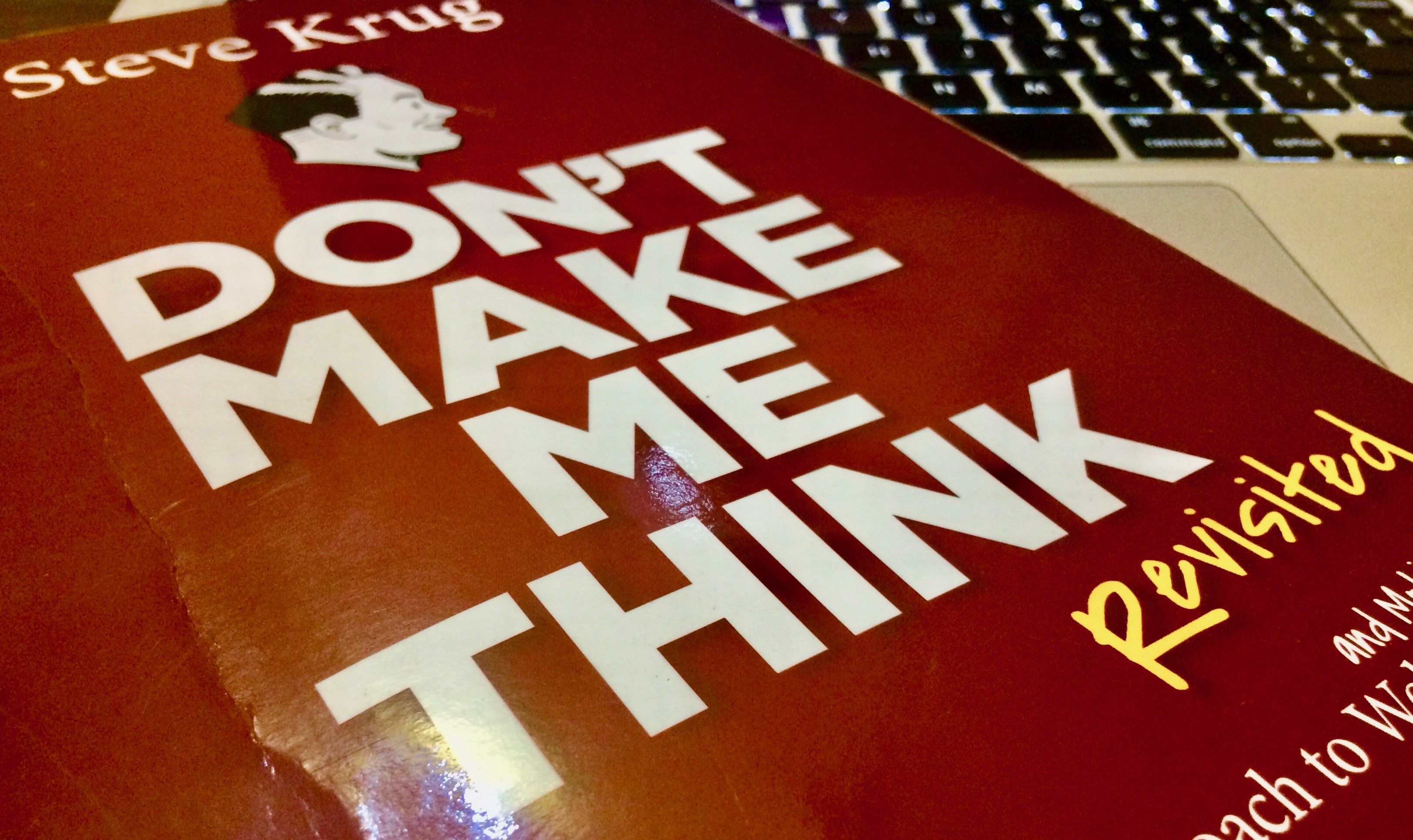
Don't make me think
Reading notes from Don't make me think
Recently I’ve been reading “Don’t make me think” by Steve Krug. If you care about usability of the product you design, this book is must read. Where the focus in this book is mainly on websites but the guideline or the principle remains same, as you want to keep the user away from confusion while using any kind of product.

Here are few selected notes from the book-
Usability means making sure something works well, and that a person of average ability or experience can use it for its intended purpose without getting hopelessly frustrated.
If you can’t make something self-evident, you at least need to make it self-explanatory.
As a rule, people don’t like to puzzle over how to do things. If people who build a site don’t care enough to make things obvious it can erode confidence in the site and its publishers.
Much of our web use is motivated by the desire to save time. As a result, web users tend to act like sharks. They have to keep moving or they’ll die.
There’s not much of a penalty for guessing wrong. Unlike firefighting, the penalty for guessing wrong on a website is just a click or two of the back button. The back button is the most-used feature of web browsers.
If we find something that works, we stick to it. Once we find something that works — no matter how badly — we tend not to look for a better way. We’ll use a better way if we stumble across one, but we seldom look for one.
Get rid of half the words on each page, then get rid of half of what’s left; most importantly happy talk and instructions.
Navigation isn’t just a feature of a website; it is the website, in the same way that the building, the shelves, and the cash registers are Sears. Without it, there’s no there there.
Some people (search-dominant users), will almost always look for a search box as they enter a site. These may be the same people who look for the nearest clerk as soon as they enter a store.
When we return to something on a Web site, instead of replying on a physical sense of where it is, we have to remember where it is in the conceptual hierarchy and retrace our steps.
Having a home button in sight at all times offers reassurance that no matter how lost I may get, I can always start over, like pressing a Reset button or using a “Get out of Jail free” card.
